

Hopefully you know the answer to these questions – the thing that sets your business apart from the other businesses out there. It’s usually referred to as a Unique Selling Point or Unique Selling Proposition – USP for short.
In the past five years or so, a trend has emerged in ecommerce website design where a brand will showcase their USP on their website in a visually eye-catching and accessible way – as highlighted by consultant Dan Barker in his recent mammoth thread of ecommerce tips. This most often makes an appearance in a dedicated bar on a brand’s homepage (usually at the top, but not always) known as a ‘USP bar’.
But what exactly constitutes a USP bar, why are they used, and which brands are using them effectively? Let’s take a closer look at this element of ecommerce design.
What is a USP bar?
In a nutshell, a USP bar is a bit of website design that aims to convey the brand’s unique proposition to a website visitor. What does the brand offer that its competitors do not?
As the name implies, a USP bar usually appears as a horizontal bar that runs the width of a webpage. It can usually be found at the top of a brand’s homepage for maximum visual impact and visibility, although some are located lower down.
There are lots of things that can be mistaken for a USP bar that aren’t one, however: for example, a promo bar, which is usually located in the same place but advertises things like “Free shipping on all orders over £50” or “30% off in our Valentine’s Day sale!”. While these are often conflated with USP bars, discounts and offers are not the same as a unique selling point, as most retailers will have them.
There’s also a difference between a unique selling proposition and a value selling proposition (VSP), which again, tends to emphasise things that benefit the customer but aren’t unique, like “100% money-back guarantee”. In my experience, many USP bars combine elements of USP and VSP, combining the brand’s unique proposition with its perceived value to the customer, but the best USP bars will focus more on the former.
What are the benefits of a USP bar?
What makes USP bars such a popular design choice for ecommerce websites? While not every website has or needs a USP bar by any means, here are some of the benefits to including one.
Differentiation
In an increasingly crowded ecommerce landscape, why should customers purchase from your brand and not another? It can be useful to foreground that information in a way that quickly catches the customer’s attention and intrigues them.
Brand ethos
More and more brands are starting to see it as important to have some kind of ethos or ethical stance in order to appeal to an increasingly conscientious consumer base. Issues of ‘greenwashing’ and authenticity aside, USP bars tend to be favoured by these kinds of brands as a way to highlight their ethos and place it front and centre of their web presence.
Visual appeal
Simply put, a (well-designed) USP bar looks nice. We’ll dive into the ins and outs of different USP bar designs more in the next section, but an effective USP bar provides a visual focal point for the webpage, and can also convey the brand’s character and style, as well as its priorities and unique tone.
Effective examples of USP bars
So, enough about theory; which brands are doing this effectively in practice? Here are six great examples of USP bar design that I’ve come across in my web travels.
1. Saddleback Leather
I adore Saddleback Leather’s USP bar, and I think it’s my favourite example that I’ve encountered of a USP bar that’s both visually effective and has really good selling points. Saddleback Leather’s products are designed to last, and the USP bar leaves you in no doubt about that: bearing the tagline “They’ll fight over it when you’re dead” (a little morbid, but it gets the point across), the USP bar also advertises a “100 year warranty” for the brand’s products and the fact that they have “no breakable parts”.
Saddleback Leather’s products are also “over-engineered”, according to its USP bar, which again sums up the brand’s approach to its goods: they’re taking no chances. They don’t just engineer them; they over-engineer them.

Source: Saddleback Leather
Add to that the fact that the whole bar visually evokes leather with its design, with a font that matches the aesthetic without being illegible, and I would call this an all-round excellent example of a USP bar. The only thing I can find to critique is that there’s no interactivity – it would be nice to be able to click on the elements and go to, for example, a webpage about the brand’s warranty, or some informative content about exactly how its products are ‘over-engineered’.
Otherwise, though, a solid USP bar that plays well to the brand’s image and the things that set it apart from the pack.
2. Lush
Cosmetics brand Lush is well-known for its strong ethical stance on a variety of issues, including animal testing and the environment, and its USP bar does a great job of highlighting this in a way that’s visually on-brand. Lush’s USP bar appears at the bottom of its website, unlike Saddleback Leather’s, but it’s still eye-catching and prominent.
Lush also packs a lot of information into its bar: it highlights six different USPs, including its “100% vegetarian products”, its fight against animal testing, its handmade products and its “NAKED!” packaging – but the presentation isn’t crowded or overwhelming. Instead, every element has its own little ‘block’ within the bar, with illustrations and stylised text making each one feel cohesive. (The animal testing ‘block’ is the exception to the rule in that the text isn’t stylised, but it works, as it gives that element a more serious and less ‘branded’ look).

Source: Lush
Again, if I had to nitpick, it would be useful for each of these icons to be clickable and lead to more information about Lush’s work against animal testing or just what “NAKED!” packaging involves. However, it has other navigation elements on the site that serve this purpose, so the USP bar is more of a visual reminder than a means to navigate the site.
I was also a little disappointed not to find a version of Lush’s USP bar on its mobile website, although with much less screen real-estate to play with, it can often be necessary to make these kinds of trade-offs. (Saddleback Leather has a more simplified version of its USP bar on mobile, which features the “They’ll fight over it when you’re dead” tagline, but no other elements).
Lush: A fresh approach to customer experiences
3. Arena Flowers
Arena Flowers’ USP bar is more visually understated than those from Saddleback Leather or Lush, but it’s still effective and fits with the brand’s aesthetic. Like Lush’s USP bar, it appears at the bottom of each page, although (on desktop at least) the bar will move as you scroll, so it’s always in view. Because of this, I think it’s a good thing that the look of it isn’t too visually distracting.
Again like Lush, Arena Flowers highlights its hand-crafted products (“Every bouquet hand tied”) and ethical credentials (“The UK’s #1 rated ethical florist”) as well as its environmental initiatives (“You buy flowers, we plant trees”). It also devotes a bit of space to inviting visitors to sign up to its newsletter.

Source: Arena Flowers
The big thing that sets Arena Flowers’ USP bar apart from the other brands we’ve so far considered is that its elements are actually clickable! Each one will take you to a page with more information about its credential or initiative – or to sign up to the newsletter.
I also like the way that Arena Flowers presents its USP bar on mobile – it’s more of a USP block than a bar, but contains all of the same elements and information in a way that makes sense for the layout.

Source: Arena Flowers
4. Treatwell
Beauty booking website Treatwell uses its USP bar to sum up in three elements why customers should consider using its service: “Smart prices”, “Book 24/7” and “Choice of top-rated salons”. It includes a little more text than the likes of Lush or Arena Flowers, but by including fewer elements, it achieves this without overcrowding the USP bar.
The USP bar sits in the middle of the page, below the booking form (which understandably takes precedence) but still well within view. I really like the little illustrations that go with each element, which are cute and visually on-brand in Treatwell’s signature orange and yellow. The USP bar isn’t clickable, but it also doesn’t really need to be, as each of the elements speaks for itself and is part of the brand’s service rather than something that visitors might need to read more about.
 Source: Treatwell
Finally, I particularly like the presentation of Treatwell’s USP bar on mobile, where it only displays one element at a time in a carousel that visitors can swipe between.
5. Who Gives a Crap
Ethical toilet paper brand Who Gives a Crap has two elements to its homepage that resemble USP bars. One is a more traditional thin strip USP bar with little icons and a few words next to each, which sits in the middle of the page, below a large header image carousel and above its products. This USP bar is unobtrusive and understated, but clean and well-designed, and serves as a visual reminder of what Who Gives a Crap’s products stand for.

Source: Who Gives a Crap
The second USP bar appears at the bottom of the webpage and serves much the same purpose, but with a different look, bigger images, and more detailed wording. I’m counting it as a USP bar even though it’s a lot bigger than most of the others we’ve looked at so far, as it has the same design and role in the website.
The first USP bar – let’s call it USP bar 1 – focuses more on product USPs, highlighting the fact that most orders have free shipping, are “made without trees”, and the fact that 50% of the brand’s profits go towards building toilets in areas that need them. USP bar 2 is more of a brand ethos USP bar, highlighting the fact that as a company, Who Gives a Crap is “Good for the world”, “Good for people”, and also “Good for your bum” (in wording characteristic of Who Gives a Crap’s to-the-point and humorous brand copy).

Source: Who Gives a Crap
Is having two USP bars overkill? If they were both as visually prominent as the second bar, I think it might be, but Who Gives a Crap pulls it off. They complement each other by highlighting different aspects of the brand’s USP, although there’s some overlap as both talk about Who Gives a Crap’s social good mission, albeit in different terms. It’s also worth noting that the mobile site just features one USP bar (USP bar 2), so only the desktop website has two of them.
I do wish that at least one of them were clickable, though, as it would again be helpful in allowing visitors to explore more about what being a B Corp certified brand means or how Who Gives a Crap’s products are “made without trees”. However, other parts of the site navigation do give an opportunity to learn about these aspects of the brand.
How Who Gives a Crap built a loyal following through feel-good branding and a commitment to CX
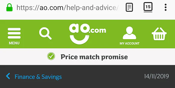
6. AO.com
Appliance retailer AO.com has a fairly standard USP bar, but manages to pack a lot into it. The bar sits just below the site’s main navigation menu, but is visually distinct in its use of green icons against a lighter background, which help it to stand out.

Source: ao.com
It offers a mixture of VSPs and USPs, including a “Price match promise”, free 100-day returns and next-day delivery seven days a week. One element I particularly like is the inclusion of its Trustpilot rating (Excellent), which when clicked leads to AO.com’s Trustpilot page. All of the other elements are clickable as well.
The USP bar has a nice look on mobile, too: it displays one element at a time in the centre, which fades out after a few seconds to be replaced by the next.
Source: ao.com
Have you noticed any effective examples of this ecommerce design element around the web? Share your favourites in the comments!
The post Six impactful examples of ecommerce USP bars appeared first on Econsultancy.
from Econsultancy https://ift.tt/3bP82px
via Ebusiness


No comments:
Post a Comment